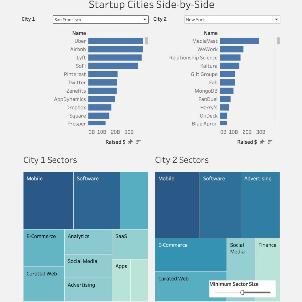
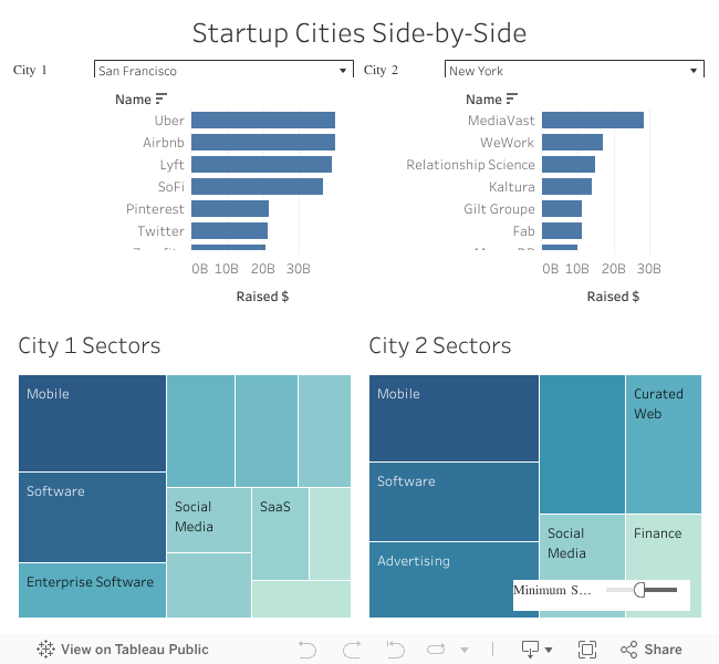
The visualization will show you side-by-side how two startup cities compare across a range of criteria. The most notable comparisons are top startups for each city, the total amount of funding for those startups received and the sectors in which they are active.
You as the user can zoom on any two cities, as long as if they are in the Crunchbase database, which was used for constructing this visualization. The main purpose was to create an interactive tool using Tableau with dynamic criteria that can be applied across different geographies.
You will probably notice that a comparison across cities and countries comes with its set of problems. Mainly it was the vastly different amounts of funding received by startups in the US and the rest of the world. Therefore, I set $40 billion as the maximum valuation, although companies like Uber, Airbnb, and Lyft surpassed even that limit. Finally, you have the ability to tweak the Sector Size parameter, which allows you to filter out the most notable sectors for each available city.

Peter, MBA, MSc, is a Product Owner, Software Engineer, and Tech (Innovation) Strategist who leverages a rare combination of software development, quantitative, and soft skills to create smart technology with a human touch. Most importantly, he is vision-driven, globally-minded change agent who is multilingual, has studied abroad, and has traveled extensively. Within six years’ time, he has developed an array of mobile apps and data-driven app products. Peter’s most recent ventures include a mobile app for property valuation and an end-to-end solution for real estate data collection.


